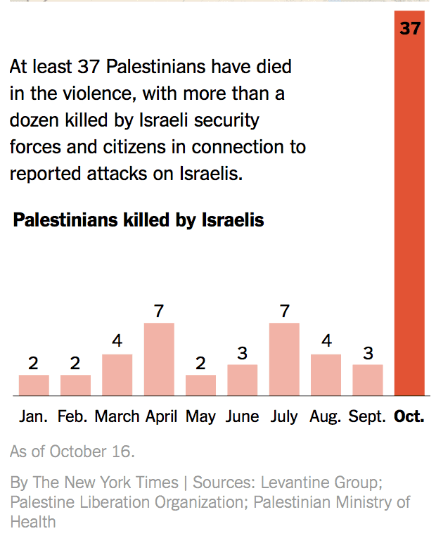
Graphics are typically used to clarify issues that could be confusing or drive home a point that may be lost in plain text. However, a graphic in the New York Times (based on information partly from the PLO) does neither. Instead, it supports the claim that the current wave of terrorism is actually best understood as disproportionate attacks against Palestinians.
The graphic shows where recent terror attacks against Israelis have taken place. The top caption says that seven Israelis have been killed. Underneath, we find the number of Palestinians who have been killed. For those who cannot grasp the number 37, the Times felt it necessary to show a bar graph with a big red bar representing Palestinian casualties this month.
 Rather than helping readers understand the situation in Israel, the graphic confuses and misleads.
Here are a few questions we have for the Times:
1. Why were 2-7 Palestinians killed monthly by Israelis prior to October? Were these 34 “victims” innocent civilians? Were they gunned down by vigilante Israelis? There is no way to tell from the information the Times publishes, but basic internet searches reveal that in almost every case, the Palestinians were killed while attacking Israeli soldiers and civilians. Of course,the sources that the Times used, including the PLO and the Palestinian Ministry of Health, might not be providing the full details to the Times. What the simple graph leaves out are the hundreds of Palestinian attacks against Israeli civilians during this time period including stone attacks on cars, firebombs, and car ramming attacks.
2. The Times claims that only a dozen of the 37 Palestinians who were killed by Israelis this October were killed related to attacks against Israelis. Are they implying that the other 25 were killed for no reason? Were these 25 Palestinians killed as they went about their daily business or while waiting for a bus or driving home? No, while this may actually have been how Israelis were murdered, the Times does not see fit to include it in their graphic.
3. Rather than spelling out how “more than a dozen” Palestinians were killed while trying to murder Israelis, the Times chooses to say that they were simply “in connection” to attacks against Israelis. Actually, the Times clarifies: These are just “reported” attacks against Israelis.
I guess because all the videos, eyewitness testimony, and hospital records of those who have been stabbed, shot, or run-over are not definitive proof that any attacks actually took place.
On the other hand, the Palestinians were not “reportedly” killed. The Times uses no such disclaimers.
Of course, this type of New York Times reporting comes as no surprise. It is part of a larger wave of biased reporting that sees “The Return of Casualty Figures as a Moral Barometer.” In other words, the simple belief that the side with the greater number of casualties is necessarily the side with the greater moral claim.
In fact, what the media should be conveying is the exact opposite. As we have written previously:
Ultimately, the numbers fail to show what’s really important – that Israel is facing a relentless wave of Palestinian terror. The moral high ground does not belong to the side that loses more people, if those people are killed trying to murder innocent civilians. The media has a responsibility to present the situation as it really is. And the raw numbers of people killed create a distorted picture.
[sc:graybox ]Reject misleading articles and graphics at the New York Times. Write to the Public Editor to explain that simply counting casualties without context fails to paint an accurate picture of what is really happening.
[sc:bottomDonate ]
