
For a while now, the New York Times has been running a daily tally of Hamas rocket attacks, Israeli airstrikes, and the resulting deaths. A cumulative scorecard is published online as an infographic inserted in the paper’s daily coverage of the region.
Today’s looks like this:
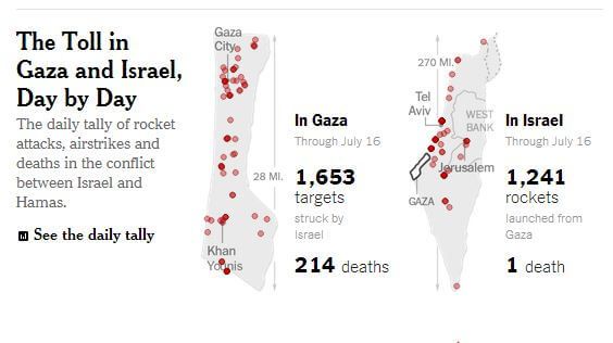 While the daily articles that contain the graphics may provide some of the necessary context for any given day, the cumulative graphic reduces the conflict to just two bits of information – rockets (or targets) and deaths. It places an emphasis on those two figures as central to understanding what is taking place.
And if the Palestinian death count is so much higher than the Israeli count, the Palestinians would seem to be the ones most worthy of sympathy.
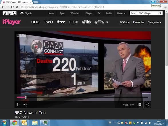
We saw a similar case with the BBC:
HonestReporting CEO Joe Hyams warned against this type of focus on casualty figures in the media:
We emphasize that the casualty figures reported in the media do not represent the true intentions of the two parties. Israel has made and continues to make every possible effort to save the lives of civilians on both sides while the Hamas terrorist organization fires rockets indiscriminately at Israeli civilians and calls on its own people to act as human shields, even at the cost of their lives.
Even the figures, however, have to be taken with a level of skepticism. The New York Times relies on casualty figures provided by the United Nations Office for Coordinated Affairs, which gets its own numbers from the Hamas-run government in Gaza, which has a vested interest in inflating the numbers. The graphic also creates a visual distortion between the size of Israel compared to Gaza, failing to capture how much of Israel is under threat by Hamas rockets.
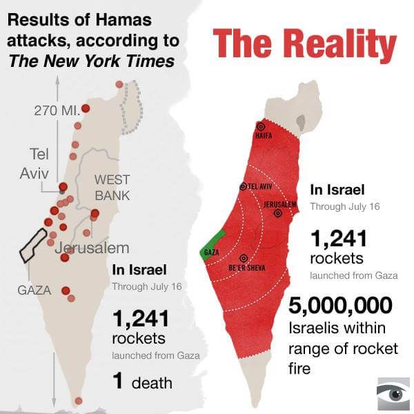
Shouldn’t the New York Times have considered producing an infographic like this?
Featured image credit: Image: CC BY-SA HonestReporting, Wikimedia Commons/Jedudedek