
We have objected to the New York Times daily “death count” graphic before. We believe that reducing the conflict to a mere set of numbers is misleading.
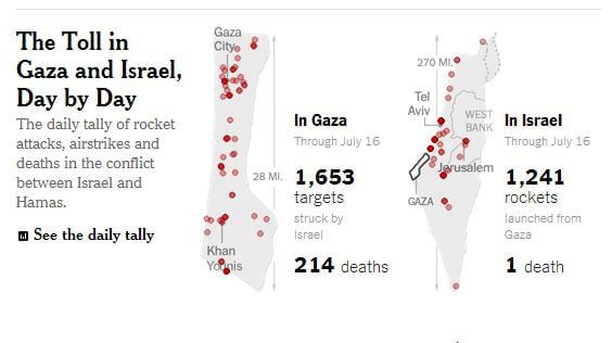
As we said two weeks ago, “While the daily articles that contain the graphics may provide some of the necessary context for any given day, the cumulative graphic reduces the conflict to just two bits of information – rockets (or targets) and deaths. It places an emphasis on those two figures as central to understanding what is taking place.”
As we have written many times, with Hamas’ use of civilians as human shields and with the Israeli investments in defensive systems, it is not surprising that there are more Palestinian casualties.
Despite this, the Times believes that an ongoing body count is essential to understanding the conflict. So day after day, readers around the world can glance down at the graphic and see how many Palestinians have died.
But if the New York Times believes this is the most accurate way to report on a conflict, why haven’t they employed the feature in other areas. For example:
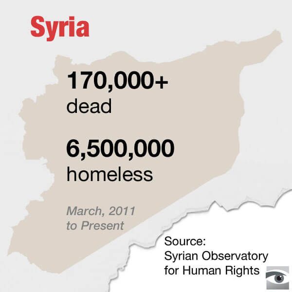
Why is the Times so obsessed with these graphics when it comes to Israel but not in places where there are so many more casualties?